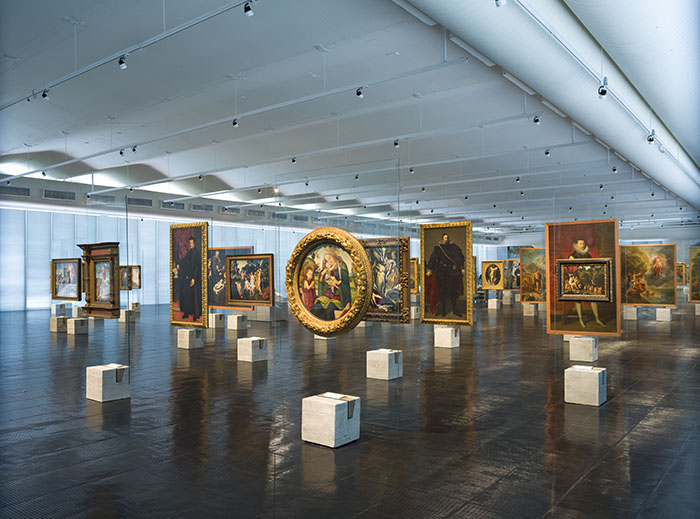
Photo: Eduardo Ortega. Courtesy of MASP.
Looking Through the White Cube
Victoria Rodrigues O’Donnell
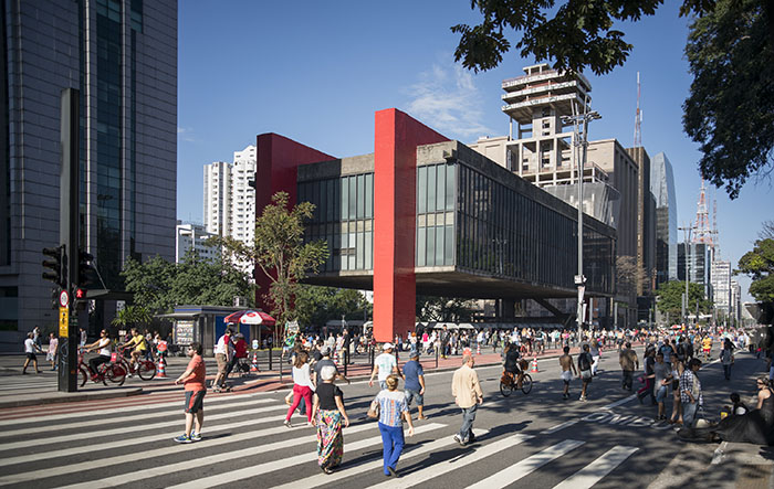
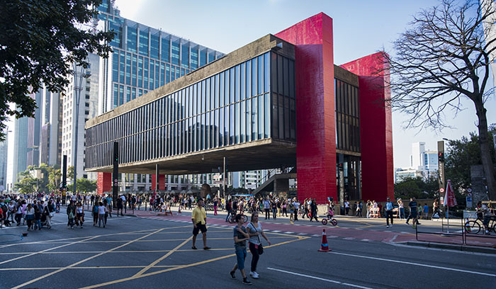
Lina Bo Bardi’s glass easels were first seen at the opening of her design for MASP (Museu de Arte São Paulo) in 1968. The Italian-born Brazilian architect is known for her modernist creations, primarily using concrete and glass, which address accessibility, utility and a careful consideration of Brazil’s rich cultural traditions. Located on São Paulo’s Avenida Paulista, the centre of the city’s cultural and financial districts, MASP is not only striking for its vermillion pillars, but the main body of the building stands as if it’s suspended in mid-air, allowing a panoramic view to remain unspoiled.
This respect for transparency and openness can directly be found in Bo Bardi’s predilection for glass structures. Prior to the MASP commission, Bo Bardi designed ‘The Glass House’ in São Paulo’s southern district of Morumbi. Situated on a hillside among trees, the house was intended to be a home for the architect and her husband, Pietro Maria Bardi, MASP’s co-founder and director until 1996. Incorporating the construction into the region’s former rainforest, as opposed to building around the landscape, Bo Bardi sought to retain the natural surroundings while creating a dialogue between the two. Similarly to MASP, the most visible part of the house appears to float as it’s held up on steel tubes, while floor to ceiling windows provide a panoramic view above the treetops. Having relocated to Brazil only five years earlier, this was to be Bo Bardi’s first built work and immediately established her as an emerging voice in the country’s cultural and social development.
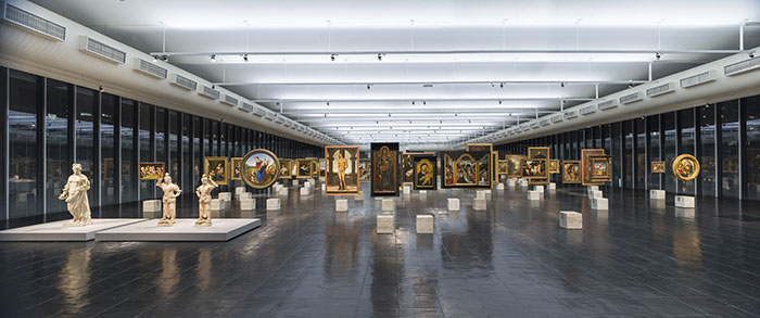
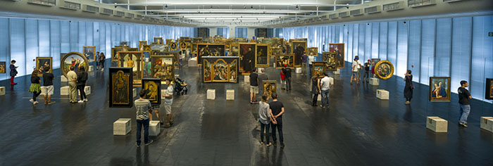
While the construction of MASP continued to extend Bo Bardi’s architectural vision for Brazil, her glass easels within them highlighted a particular attention to detail for how the building should function and interact with audiences. Made up of glass sheets inserted into square blocks of concrete, these easels challenge our understanding of viewing art and transform paintings into sculptural objects. By removing artworks (ranging from Raphael to Picasso) traditionally seen on walls and placing them on easels, Bo Bardi radically toyed with order, representation and artistic convention. This divergence from European traditions embodies a decidedly modern approach to conveying art history, but also marks a desire to initiate a collection within a South American institution.
The minimalism and fluidity of the glass easels can also be read in light of Brian O’Doherty’s seminal work, Inside the White Cube: The Ideology of the Gallery Space. Published in 1976, the collection of essays has been widely discussed for its examination of contemporary methods of gallery design - the titular white cube - and the effects this unavoidably has on what is exhibited. This space posits itself as being neutral and timeless, the ideal environment for observing works outside of any historical, social or economic context. However, the absence of these factors looms largely over the objects on display and emphasises their eternal value. O’Doherty scrutinises the development of this ideology from the ‘horrid concatenation of periods and styles’ of the mid-nineteenth century Salon, to the hyper-minimal post-studio art scene of the 1970s. The “easel picture”, with its frame and limits, is “as much a psychological container for the artist as the room in which the viewer stands is for him or her.” This promise of security and comfort within the easel’s frame also establishes the object as a presumed masterpiece with monetary value (an interesting factor that seems to permeate a gallery space, regardless of an artwork being with or without a frame).
Despite the convention of a white cube aesthetic in contemporary galleries, MASP’s history of resistance to this spatial practice provokes further debate surrounding accessibility and the art historical canon. Their decision to re-introduce Bo Bardi’s glass easels earlier this year, after being removed two decades ago for conservation issues, help to commemorate her major contribution to museum practice, as well as return the space to its use as a semi-permanent collection display. The open-floor plan, filled with light, glass easels and a few plinths, has never dictated a set path for visitors and veers away from grouping artworks related by school or style. Bo Bardi’s original set-up arranged the easels with regard to movements or regions, however they have now been organised into chronological order. Although this may seem like a rather traditional move by the curators, the order still remains resistant to canonical art historical narratives, as visitors are able to start and end wherever they like. Along with allowing visitors to create their own paths through art history, it is vital to point out the invitation they are given to observe paintings from behind. Unless you work within the art world, it is rare to be given the opportunity to see the reverse of a painting. Are there any cryptic markings or further indications of authenticity? While the labels may not reveal all the answers, the chance to provoke discussion and provide greater insight into some of the world’s most renowned artworks was fundamental to Bo Bardi’s design.
This method of presenting artworks may sound chaotic and haphazard, but in an echo of the building itself, they seem to float in the air in such a way that reinforces their transcendental qualities. German writer and curator, Roger M Buergel describes the liberating potentials of this arrangement: “each artwork was shown to be its own site, a display mode that attested both to the migratory destiny of the pieces, but also, and more importantly, to a lack of institutional framing.” Indeed, while a white cube aesthetic may also strive to decontextualise gallery spaces and give artworks more room to breathe, Bo Bardi’s easels desacralize the works by removing them from the walls. O’Doherty likened the white cube to an ancient tomb in which the objects on display are imbued with eternal value. While the two are not mutually exclusive, Bo Bardi’s intention of desacralizing traditional museum displays supported her overall desire for greater audience engagement and approachability.
The visual impact of Bo Bardi’s glass easels is undoubtedly still felt today and I was blown away by how innovative they continue to feel – almost 50 years later. Weaving in and out of Renaissance works one minute, to then feeling drawn towards a nineteenth century piece by Brazilian artist Almeida Júnior can hardly be compared to walking from one room to the next within the National Gallery or the Musèe d’Orsay. I began to wonder if European institutions ever have or ever will deviate from customary forms of hanging art, both white cube and Salon-esque. Art historian Rosalind McKever suggests that the Sainsbury Centre for Visual Arts in Norwich and the Louvre Lens in France are examples of Bo Bardi’s influence on radical approaches to collection displays this side of the Atlantic. Both galleries organise their artworks in ways that seek to promote openness, fluidity and a rejection of imposing the art historical canon upon its visitors. Different narratives can continue to emerge and thus invite art history to be seen anew.


